Yet another three scenarios for COVID-19 deaths in South Africa
I was invited to work with the modelling team at The Singular Group to develop three scenarios for the COVID-19 pandemic in South Africa. It is always interesting to work with a team that has been grappling with the same problem but from a different starting point and armed with a different tool set.


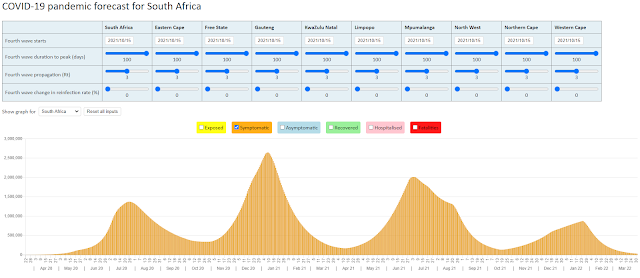
The three Singular scenarios are only intended to forecast the pandemic to the end of August, although I have shown the forecast for COVID-19 deaths unto the end of the year in the graph below:

The three scenarios differ in terms of three input assumptions:
- What proportion of the population will be infected with the virus once the first wave of infections comes to an end in the Western Cape (input assumptions here were 13%, 16% and 20% for the best, base and worst case scenarios)
- What proportion of the population in the other provinces will be infected with the virus once the first wave of infections comes to an end in those provinces (input assumptions here were 5%, 10% and 20% for the best, base and worst case scenarios)
- What Infection Fatality Rate (IFR) should be used to fit the reported deaths in the model (average IFR's of 0.47%, 0.51% and 0.74% were used for the best, base and worst case scenarios)
The most important of the input assumptions is the proportion of the population in the other provinces that will be infected in the first wave. The Singular team pointed out how the experience in Europe shows that the experience in other regions of a population falls far short of the experience in the region that is hardest hit by the pandemic.
I hunted around for an analysis showing this and found the following graph by The Health Foundation. The graph compares the 'excess deaths as a share of usual deaths' for the different regions in the UK, France, Italy and Spain.

The next few weeks will not only give us an indication of the impact of the first wave of COVID-19 infections in the Western Cape, but more importantly will tell us how similar (or not) the shape of the first wave of infections in some of the other provinces will be.
The NMG model was last updated on Wednesday, 24 June, and can be found at https://nmg-covid-19.sctechnology.co.za/. The web tool will allow you to model each province separately, and shows the forecast for South Africa as an aggregate of the forecasts for each of the nine provinces.
29 June 2020

Comments
Post a Comment